McLaren has changed its signature, but it has not abandoned its racing identity. Unveiled on September 22, the new branding replaces the familiar tightly drawn lettering with a more open, upright wordmark. For Formula 1 fans, the first impression is striking: a name associated with speed now looks less as though it is leaning into a corner.
The change applies across McLaren Racing and McLaren Automotive. According to the company’s announcement, the lettering draws on the sign above the McLaren family service station in Remuera, Auckland, where Bruce McLaren built the car that delivered his first racing victory. The reference makes this less a clean break than a deliberate return to an earlier chapter.
Old versus new: what actually changed?
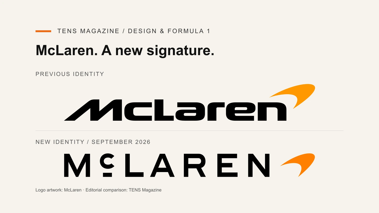
The comparison above shows the central difference. The previous mark compresses the name into a continuous, muscular shape. Its slanted opening letter and closely connected forms suggest forward movement. The new lettering gives the individual characters more room and uses a raised “c” with a short horizontal bar beneath it.
That detail is important. Without it, the new design might read as another premium brand adopting widely spaced capital letters. With it, the name has an unusual identifying feature: something a viewer can remember beyond the orange symbol beside it.
Neither treatment is inherently faster, more luxurious or more authentic. Those are associations created through use. The older logo carries the accumulated familiarity of race broadcasts, merchandise and road cars. The newer one has to earn that familiarity, even if its historical inspiration predates the version it replaces.
The Speedmark is staying
McLaren says the Speedmark remains part of the identity, alongside papaya and the Speedy Kiwi. The redesign therefore should not be confused with the removal of every established symbol. The company is changing how its name is written while retaining recognizable elements around it.
That gives the change a useful balance. A completely unfamiliar symbol would ask supporters to relearn the brand. Here, the orange Speedmark provides a bridge between two substantially different typographic treatments.
Why this matters beyond the paddock
For TENS, the interesting question is not simply whether the new version looks better. It is whether the identity can work equally convincingly on a team shirt, a small phone screen and a road car. A logo that impresses in a launch graphic still has to survive embroidery, sponsorship layouts, motion and distance.
There is a trade-off. More space between letters can give a wordmark composure and clarity, but it also changes the compact silhouette fans recognize immediately. The previous design looks dense and urgent; the new one looks more measured. Whether that reads as confidence or a loss of energy will depend partly on the setting.
The historical reference provides a stronger explanation than change for its own sake. Yet heritage should support the design, not excuse it from practical scrutiny. Most viewers will encounter the lettering without reading the story of the Auckland workshop. It must still communicate effectively on its own.
A new signature, not a new sporting promise
There is no reason to treat a branding announcement as evidence of improved performance or a change in competitive direction. The logo does not tell us how a car will behave under braking or how a team will execute its next pit stop.
Its job is different: to make a growing collection of McLaren experiences feel recognizably connected. The most persuasive reading is an attempt to combine a quieter wordmark with familiar racing signals. The test will come through repeated use, long after the initial debate over which version fans prefer.
Reporting is based on McLaren’s September 22, 2026 identity announcement. Logo artwork: McLaren, via Wikimedia Commons; comparison design by TENS Magazine. Marks are shown for editorial identification, without implying endorsement.